
Read in 5 minutes
The product pages are the area of your website to showcase what you sell. Much like with a physical shop, you want to show off your goods in their best light and give the customer as much information as possible to help them come to a buying decision.
But what details should you include? In this blog post, we will share with you the elements we’ve found to work well from our experience of compiling product pages over the years. We can split these into three core areas: the essentials, good practice, and then the final flourishes. We go into the specifics included in each below.
These are things you should always feature on a product page. They give the customer the bare minimum amount of information they need regarding a product. Some are pretty obvious, like Product Name and Product Price. These speak for themselves! But others sometimes get missed or aren’t as user friendly as they could be. Take, for example, the Quantity/Add to Basket button, which should have the option to add one or more of the item, along with any product selections, to make the purchase as easy as possible for the customer.
It’s unlikely you have forgotten the Product Image, but not all images are created equal. A large image, followed by a gallery of smaller preview images from different angles, enables your customer to see the product detail alongside Image Zoom so they can focus on specific areas.
It’s best practice to have both a Short Product Description and a Full Product Description. The former is a little like an excerpt and helps to outline the product’s value and usage for your customer as a quick view. The latter is a detailed product overview to give your customer all the information they may want. It’s also essential to cover Additional Details, which are usually specifications and should include at a minimum Weight, Dimensions and any Additional Requirements; things the product requires to function that don’t come with it, such as batteries.
These are things that aren’t always included but often should be in our experience. For example, we mentioned product images earlier, but have you considered Video as well. We highly recommend including a video, if you can, either of the product itself in use or showing the product’s selling points. It’s a great way to enable the customer to get a feel for the product even though they cannot touch it physically. Another valuable feature to have on your product page is a Newsletter Sign-up, which is a great way to build an email list (more on this later).
Positive reviews help give potential customers’ confidence in purchasing from you. So prominently display Reviews (and include their structured data, so Google shows the stars in search results). Ideally, with a person’s name, whether they bought the product, a star rating out of 5, a brief review and their image. You can use Gravatar or similar for this. Speaking of which, include a Form to Add a Review, too. Ideally, use something like Trustpilot, Trusted Shops, Google My Business reviews or similar to get External Reviews. Link out to this prominently and show your star rating with a widget embedded in the page where possible.
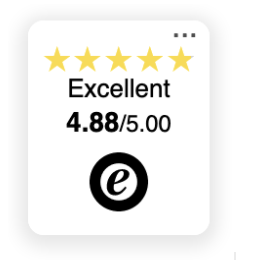
Example of Trusted Shops widget on a product page. Note the level (“Excellent”), and stars are shown.
There are a few pieces of information you should include about terms of sale on your product page. First, add a tab or a prominent link that opens up to explain Delivery & Returns. The content should be a simple list of options and prices for delivery that the site offers and will probably be the same for each product. It should also explain the returns procedure.
Second, feature any promises you make prominently. These include Delivery Promises like “FREE delivery to Mainland UK for orders over £50” or “next day delivery” and Product Guarantees/Promises such as “Free Returns” or “30-day money-back guarantee”. By the add to cart button is a good place for both. For the latter, explain how the process works; use a “Read More” link if it’s a long explanation.
As a side note, if there’s a discount on the usual prices for any reason, Reinforce Sale Prices. Showing both the regular price followed by the sale price emphasises the deal to the customer.
Have you thought about how you display any visual attributes of a product, like colour options? Swatches are a great way to do this as they are more user friendly than a dropdown, enabling the customer to see all the possibilities together at a glance.
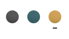
In this example, the coloured dots above are selectors for the colour you’d like to buy the product.
Building on the descriptions mentioned earlier, a bulleted list of the Key Product Features of the product gives the customer additional specifics they may need to know. For example, for a light, you might have “200 lumens of light”, “25m² of light coverage”, and “6m motion range.” It can also be helpful to give Usage Examples. If applicable, provide a bulleted list of where you might use the product, such as “Perfect security light” or “Motion sensor driveway light”.
Finally, these items really are gold standard stuff. They don’t always apply, but when they do are definitely worth considering to get you those extra sales.
An Abandoned Cart Follow up Email should go out if the product’s added to cart but not purchased, preferably within the hour. If the website visitor enters their email in the checkout, or a sign-up form, e.g. newsletter, set up the abandoned cart email to go out to it. It can help to offer an added benefit, like a 10% off coupon, to encourage the final purchase. Likewise, if a user views a product and you later put it on sale, having an automated Price Drop Email go out to them may get additional sales you’d otherwise miss.
If your sales can get to a high average order value, we suggest £75 or higher; consider offering Klarna, PayPal Credit or something similar that allows the customer to spread the cost. If you do, make sure this is prominent on the product page, e.g. “Pay in three with Klarna and get this for £53.33 per month”.
Product pages are one of those examples where actually more is more. Including as many of the specifics above as possible can really bring the products to life for your customer. Improving your website’s shopping experience can be the difference between them staying on your website to find all the information they are looking for or searching and then potentially buying elsewhere.
Rigorous Digital is a WordPress Agency based in Cheltenham, UK, servicing an international client base. If you would like more help with your product pages or any other web-related queries we can help with, please get in touch.